CLICK HERE AND GET DRAWING LESSONS INCLUDED IN THE 2020 MEMBERSHIP OPTION
The best way to learn values, I’ve found, is by using a toned sketchbook. It’s great because it starts you out in a midtone value that you can either increase or tone down. This gives you great flexibility and will help you immensely with painting.
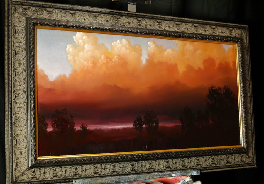
Values are one of the most important things in painting. Value creates light, contrast and focal points. If you’ve ever looked at some of the Hudson River School of art guys from the 1800s like Bierstadt and Innes you’ll see that they were masters of value. Using light clouds in behind dark clouds to create visual interest points, or great variations of value on mountains in the distance and foreground to create depth.
So how do you create value with a toned sketchbook?
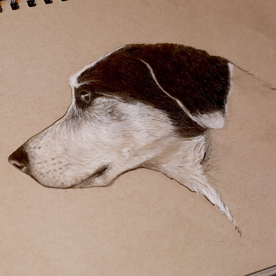
Using both dark leads and a white pencil I create different values. Starting with HB and B pencils I start a sketch. These leads are hard and create lighter lines. I then start to add some of the light values with the white pencil. The reason I do this is because the white pencil doesn’t go over dark lead very well. So in order to prevent smudging I put in lights first. I only work in some lights, not all, and put them in faintly.
Then I start going with darker, softer lead like a 4b pencil. I start putting in some semi-dark values. Once I have some semi dark values in I switch back and add in semi light values with the white pencil.
Eventually I go to my 8b pencil and put in really dark values. Then the last step is putting in the brightest whites (values) with my white pencil.
Doing this process will help you with your paintings. Why?
Because a lot of times its hard to tell what colors have brighter values in your subject. For example a red might be really bright but be darker in value than a blue that is in the distance. By breaking down your image into black and white values you’ll start to understand and see all of those slight variations. This will help you create effective light and detail in your paintings.
So get a little sketchy and start sketching!
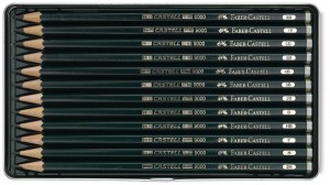
Thanks for reading my quick tips and tricks for this week! In the meantime I’ve included pictures of the supplies I use for my value sketches below. I also have two great painting lesson offers below as well!
Here are the supplies I use:
Faber Castel Drawing Pencils
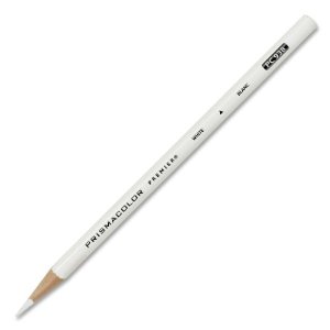
Prismacolor White Colored Pencil
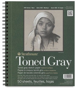
Strathmore Toned Gray Sketchbook Series 400
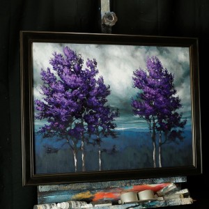
Order The Reach of Deep Purple before May 12 and save $10! CLICK HERE!
New Lesson being added to Oil Landscape Fundamentals! Click Here for more info!