CLICK HERE FOR MY LATEST PAINTING LESSON!
It seems like staring at a vast amount of paint tubes, varying in color, can be the most stressful part of painting. Which colors do I choose? There are so many!
Each artist has a different approach to painting skin tones. I’ve researched colors for years, and the easiest palette I’ve come across is the Zorn Palette.
Anders Zorn (18 February 1860 – 22 August 1920) was a famous master painter from Sweden. He developed a simple palette for skin tones. When I say simple, I just mean that he used an extremely limited palette. You can read more about Zorn here: http://en.wikipedia.org/wiki/Anders_Zorn
Skin tones are a vast array of reflected light, transparencies and unexpected colors. By limiting your palette you can concentrate on making small variations and layering color.
The Zorn Palette is the following colors: Yellow Ochre, Crimson, Black, Titanium White. That’s it! Just 4 colors. You can vary your palette by the type of black and red that you use. Even with just 4 colors you can make a large variety of colors and shades. I created a mixing chart below to show you the main colors you can create. You can always create variations of these colors depending on the ratios of the paint mixed.
Click the images below to make them larger, and if you’d like to print them out.
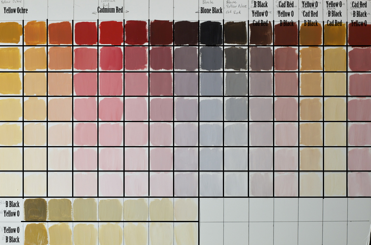
Starting from the left we use plain Yellow Ochre. As we move down we add titanium white. As we move to the right we add a small amount of red, and then more and more until you get to just cadmium red. At this point we no longer have yellow mixed in with the red, we start off again with just red. As we move further to the right we add bone black until we just get bone black. Next to the black we have the three colors mixed together in different ratios. Whatever color is at the top is the most, mixed by the second most, mixed by the smallest amount. This is where we can get a large variety of combinations. I just used the major combos on this chart. But if you mix different proportions of colors you’ll get slightly different variations. Then at the bottom of the chart is yellow and black mixed together which create a sort of greenish tone.
I’ve created two charts to show two different skin tones. I used the eye drop tool to grab the color of the skin on the left and then match it up to the chart on the right.
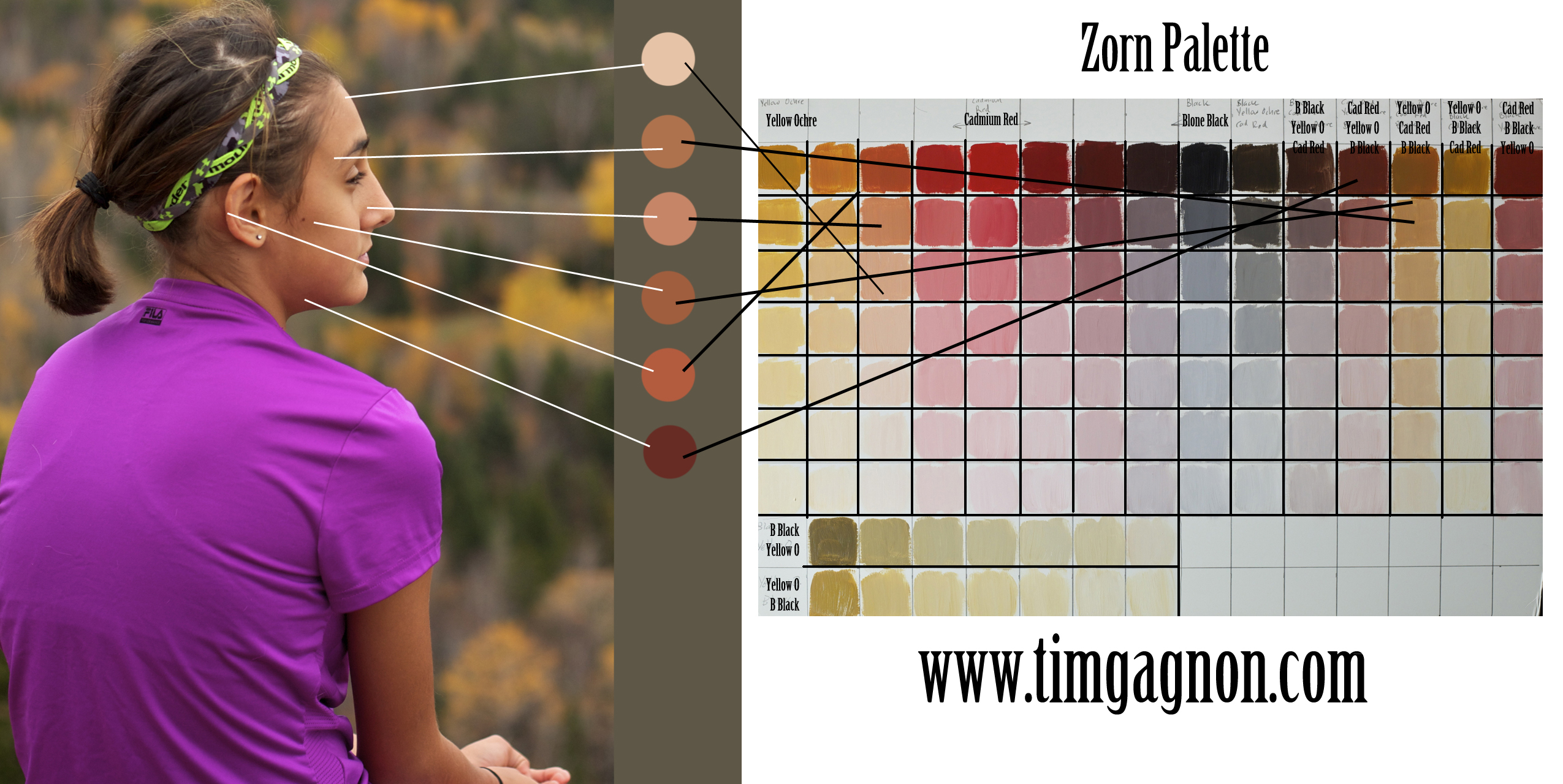
Wherever I found colors that did not match up to the chart exactly, I connected it to the closest color. You’ll be able to match the color accurately with just slightly different proportions of paint. But since you are using the limited palette it will be easier to find the correct shade. You just have to find the color that is close and add or subtract colors to find the correct shade.
Below you can see a lighter skin tone and how it matches up.
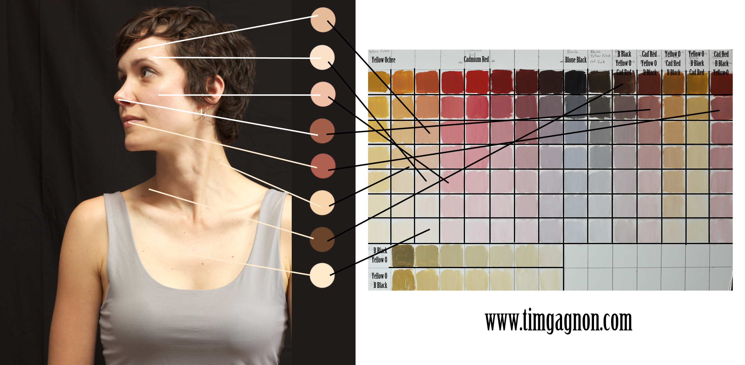
You can use this chart to create your base painting. Then when all of your contours are completed you can use washes of other colors if you feel they are necessary. Most of the time you won’t need to add anything else. You’ll be surprised at how effective this palette can be.
Like I mentioned earlier, the colors for your palette will make different outcomes. If you use Ivory Black you’ll get slightly different variations, but you’ll still be able to find combos that create the colors you need. Or if you use Alizarin Crimson you’ll get different shades. Crimson is a common color used in the Zorn Palette. I just prefer using Cadmium Red. Use whatever colors you feel comfortable with. Create a color chart and then get painting!
I will be doing the two above images as lessons. We will go over transparencies and layering to make the skin look more real. Stay tuned and thank you for reading!
-Tim